What is economic inequality? Put simply, it is the concentration of economic resources among a population. Economists like to calculate economic inequality through income inequality, as it's measurement is easier with data readily available.
A useful tool to measure the concentration of income among a population is the Lorenz Curve.
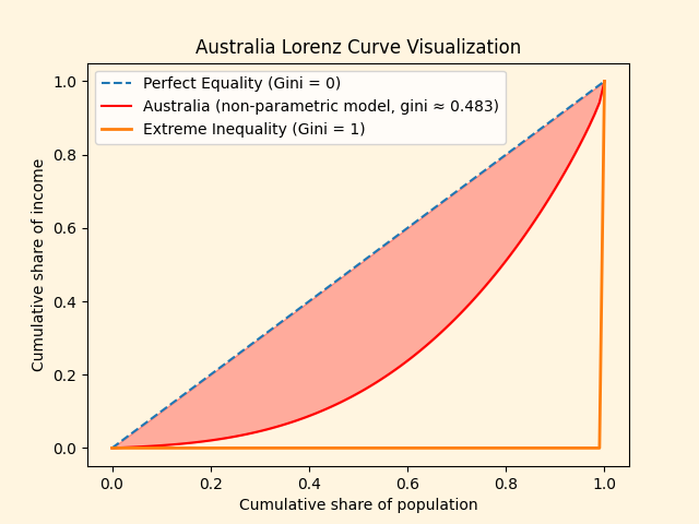
This Lorenz curve describes Australia's income share at various proportions of the population.
The orange and blue lines describe a universe where one person has all the income and universe where all income is evenly shared, respectively.
Finally, the red line describes Australia: somewhere in the middle. It follows then, that the shaded area represents inequality.

Enter the Gini Coefficient: a measure of the size of the shaded area.
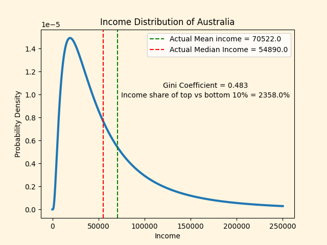
Australia has a Gini coefficient of 0.48, with the top 10% earning roughly 23.5 times the bottom 10%.
But what does this actually look like in terms of dollars?
Income distributions are heavily skewed towards higher incomes. To model this, economists use families of statistical distributions with long tails to the right.
These tails represent the small group of ultra-high incomes.

Have you ever wondered how you stack up against your peers?
How about your peers in your suburb?
How was this calculated?